«Back ·
Tracking: {
'Country Code': 'US',
'Language Code': 'EN-US',
'Email Hash': 'unknown',
'Vendor User Id': 'unknown',
'Vendor Id': 'unknown',
'Customer Type': '',
'Offer Code FONT Download


 Designer:
 Rian Hughes
Publisher: Device
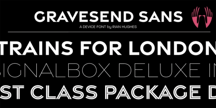
Smart, legible and elegant, Gravesend Sans is a based on the unique typeface used for the iconic grass-green signage for the now-defunct Southern Railway. In existence from 1923 to 1948, when it was nationalised, it linked London with the Channel ports, South West England, the South coast resorts and Kent. The same design was also used for the 'hawkeye' signs on the London, Midland and Scottish Railway, differentiated by black letters on a yellow background.
Reference for each letter was taken from vintage 'target' station nameplates and other platform signage. The rarest letters were the Q, seen in Queens Road Battersea, the X, seen in East Brisxon, and the Z, used in Maze Hill, site of an infamous train crash in 1958. Being hand-made, the letters often differ in width and thickness. There was no lower case. The Bluebell Railway, a heritage steam line, runs over part of the old Southern Railway network and uses a very similar type.
The design of the numbers differed considerably, but here have been taken from the Device 112 Hours font Smokebox. As well identifying platforms, they were used on the front of the steam engine's smokebox, hence the name, and stylistically are more in keeping with the letters than some of the squarer versions that can be seen in old photographs.
William Caslon IV is credited with the first Latin sans-serif type, shown in a 1816 Caslon specimen book. 'Two Lines English Egyptian', as it was called, was caps-only, and there are several close correlations between the two.
Includes a selection of authentic arrows and manicules, plus abbreviated ligatures such as 'St.' (Saint or Street) 'Rd.' (Road) and 'Jn.' (Junction). The Cameo version includes many graphic banner elements that can be freely combined.


 Smart, legible and elegant, Gravesend Sans is a based on the unique typeface used for the iconic grass-green signage for the now-defunct Southern Railway. In existence from 1923 to 1948, when it was nationalised, it linked London with the Channel ports, South West England, the South coast resorts and Kent. The same design was also used for the 'hawkeye' signs on the London, Midland and Scottish Railway, differentiated by black letters on a yellow background.
